I created the brain signage on illustrator, using the same typeface used in the other promotional material. I wanted to take inspiration from sections in the film where it shows the synapses in the brain glowing with energy. We decided the best way to create this would be to do some light up signage. We decided to convert a light box into some light up signage. I planned to laser cut out a stencil to place over the box.
We wanted to stick with the ambiguity across all the products so once again we showed only the relevant copy and used another one of the relevant tag lines to accompany the imagery and text.
I experimented with the type until it looked evenly balanced and mocked it up too see what it might look like when on the light box. We once again stuck with the blue and yellow colour scheme.
After laser cutting a couple of versions out we got on with painting the components. We decided acrylic paint would be the best method for the job as we could make sure the co lour was bold and bright by applying several layers of paint.
We created 2 different versions of the sign, one to go on the light box and then a solid version with the colours inverted. We mixed a nice vibrant blue and yellow to keep the consistency across the deliverables.
For the solid version we had to glue the pieces ontop on a marked board. We used the inverse pieces of each laser cut board to make sure there was no waste.
To give the sign a yellow glow we printed out a sheet of acetate with a block of yellow on it. This way we could stick it behind the stencil so that the light box would shine through the acetate. This was a bit of a fiddly job as I had to stick all the counters back onto the acetate to complete the letter forms.
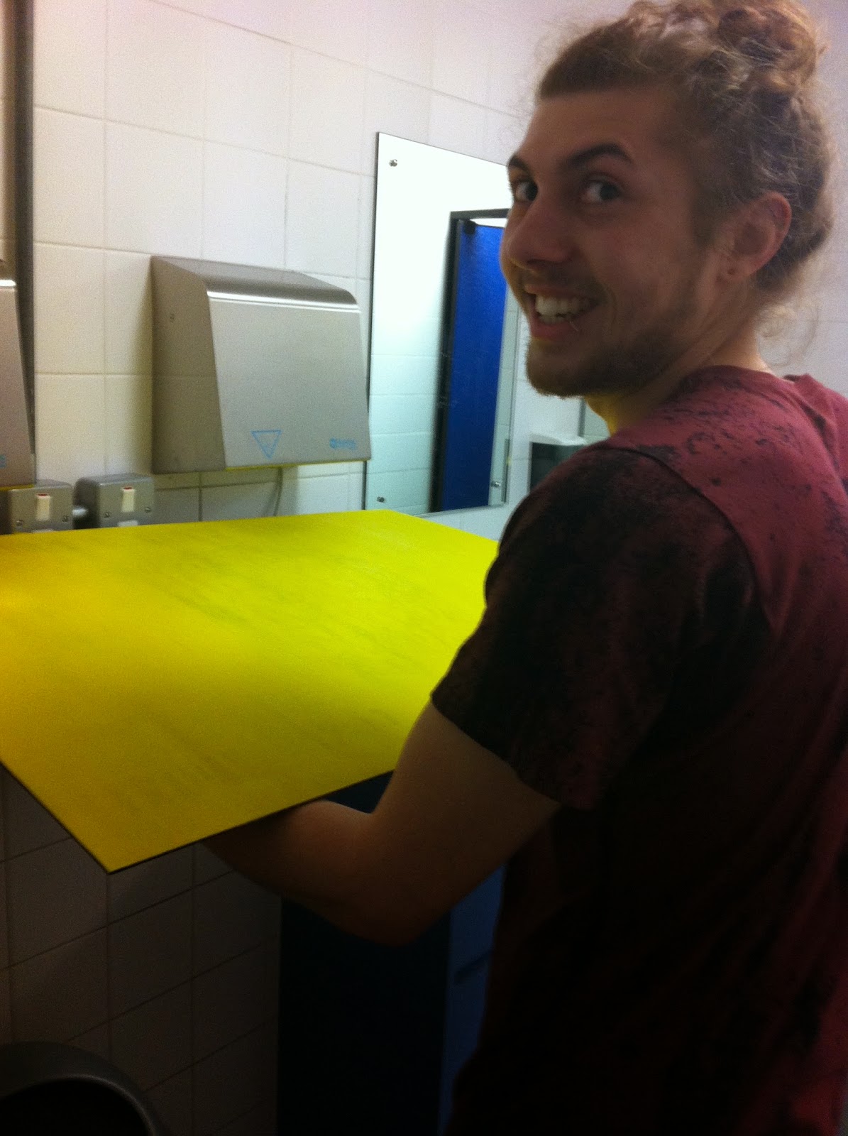
We attempted some quick drying using the toilet hand dryers which worked a treat. Because we had laser engraved the board of the yellow sign we were able to put all the pieces back on in the right place as the grooves were still present but the marks were painted away.
This is what the sign looked like before the acetate was applied to the light box. We decided to change our original plans exposing the other section of the brain instead of just the creases/line section as this had a much stronger impact.
After the acetate was added the sign gave off a nice yellow glow. To give it an even stronger glow we would of layered up the acetate however it was fairly expensive to print on acetate so we settled for one layer.
After speaking to health and safety and the estates office we found that we needed to make the light box as secure as possible as it could risk the safety of others. We went and spoke to the wood work shop and gave them the dimensions of what we needed and they produced this awesome stand for the light box to sit securely in. It was fastened in really well with no risk of it falling out. Cheers to Matt!
After scouting out college we figured the best place to have the signage would be in the entrance as everyone has to come in or leave this way. We found this spot to be the best place as it was technically a dead spot with no risk of students or staff colliding with it. It also had a power source which meant there was no need for trailing cables. The lightbox and stand fit snugly in the gap on show to all.
This is the other sign we produced. It is bright bold and eye catching, the sign is 3d and sticks off the board giving it that extra dimension and making it that bit more noticeable than your standard poster.


No comments:
Post a Comment