Showing posts with label Secret 7". Show all posts

Thursday, 27 March 2014

Secret 7" Winner - T.REX Get it on


After waiting a few months the results came back from Secret 7, I was fortunate enough for one of my designs to be chosen by the judges. This meant that the album would be on display in a London gallery for a week and then sold on for charity. This was a good day, it feels great to actually win something after all my time at Uni.


Here you can see my design entry on the website.


The lucky buyer!

Saturday, 22 February 2014

SECRET 7" - Age of Reson - Extended Brief

Final Screen Prints - 2 Colour + Spot Varnish


As with the other secret 7' submission I wanted to push the brief further and experiment some more in the print room. This was mainly because I would like to keep pushing my printing skills and improve my practice whilst I have access to all the equipment at Uni. I found this print was much easier to register than the 'Get it on' album cover as there was only 2 colour layers involved with this design. The print came out much smoother in this run and there was only a few prints with streaks on the black layer. Ideally it could of done with a bit more ink in the mixture or possible doing a 2 pulls on the black layer. 


I decided to use the Snowden paper to print my designs on as the stock was a decent thickness and took the ink very well. I was considering using the Somerset paper however that would of taken on far too much ink and allot of the vibrancy would have been lost. I am happy with the registration on the majority of these prints and am also pleased with the spot varnish. I definitely think that this print run went allot more smoothly than the T-Rex designs. Overall I am happy with the outcome of my prints, I think I will now try and digitally print both album covers out and create some real album sleeves.

Lino Prints - 2 Colour
 

As an extra task I decided to experiment with lino printing, after seeing other students in the print room creating lino designs I was intrigued to give it ago my self. I noticed that the inks they were using were oil based and created a much more rich shiny image that gave off a really vibrant finish. With this in mind I went and booked myself a lazer slot, and tool my file down to the workshop. I loaded my document onto the computer and then rasterized the image to burn the negative space on each layer. Originally I was going to cut right through the design and try experimenting with the different pieces however the technician thought that it would be too fiddly so I stuck to 2 separate layers.


Unfortunatley I spotted a problem after I had watched it on the lazer cutter for over an hour,... I had forgotten to reverse the image so that it was back to front. This meant that the type on the TV would be back wards and so would the symbols. I decided that instead I would just cut the screen out of the TV and just leave a blank space as the message was still clear with the imagery, and the symbols didnt matter too much as they were still recognizable when back to front. This made the image abit more obstract but still has the desired effect. One other error that came about was that the negative space had not burnt down far enough so inky marks kept being transferred onto the parts of the lino that were not supposed to be printed. However I really like the effect this has given, it has essentially given the image a more 3D quality highlighting the edges of the flames and also accidentally creating a white noise like pattern on the TV screen which works equally as well as the type.

Printing has a massive learning curve, the more you do the more you understand, you will always make mistakes, but once you have made them once they are hard to forget. Its not as simple as just pressing the delete button like on the Mac, printing is all about the preparation. It is important to make sure everything is ready to go, the inks need to be at the right consistency, the stock needs to be evenly cut and the process needs to be smooth and even in order to get the desired effect. I had loads of fun doing this lino print, and I am really happy with the finished product, the oil based inks make the image pop off the page allot more than the water based inks.

Thursday, 20 February 2014

SECRET 7" - Get it on - Extended Brief

 Final Screen Prints- 3 Colour + Spot Varnish


I decided to extend the brief further by producing a screen printed outcome of the design. This was mainly to better my understanding of print and to have a some fun. It was also nice to have a break from the computer screen and get messy for a while. I produced a 3 colour print with a spot varnish on top to give it that PVC latex quality to reinforce the sex appeal! I had a bit of trouble mixing my inks to start with and completely misjudged the colour which set me back a bit. I also had some trouble with the black layer, as there was too much binder in the mix which left an uneven coating on quite a few of the prints. I also had a lot of trouble with the spot varnish and struggled to get an even layer causing a patchy varnish which has let the prints down slightly. I would love to have ago at reprinting these when I have some more free time, and would definitely alter my layers to trap the ink and get rid of the white spaces where it has been slightly miss-registered.

Wednesday, 19 February 2014

SECRET 7" - Black Sabbath - Age of Reason

The Brief


Secret 7" take 7 tracks from 7 of the best-known musicians around and press each one 100 times to 7" vinyl. The Brief entailed choosing a song to visually interpret in my own style, resulting in a one-of-a-kind sleeve for every 7”. The brief was pretty open and we were able to produce pretty much anything as long as it is within the size constraints and doesn't include the song name or artist on the design.

After completing my T.Rex cover I decided to do another secret 7" brief but this time for the great metal legends that are Black Sabbath. The tune this year was taken from their latest album '13' and is entitled 'Age of Reason'. The song is about how the world is controlled and manipulated and is built on the premises of money, politics and religon. There is loads of evil going on in the world that is ruining the planet, whilst everyone is oblivious to whats really happening and are kept docile and distracted by the shit in the media. That is what I have interpreted from the lyrics and have asked several people what they think the song means and all have responded with similar answers. I think the theme of the song is interesting and there is potential for some powerful imagery.


Lyrics

Do you hear the thunder
Raging in the sky?
Premonition of
A shattered world that's gonna die.

In the Age of Reason,
how do we survive?
The protocols of evil
Ravaging so many lives?

Mystifying silence
Talking Peace on Earth.
We should judge each other
For ourselves not what we're worth.

Sustainable extinction,
A fractured human race.
A jaded revolution
Disappears without a trace.

Always felt that there'd be trouble.
Mass distraction hides the truth.
Prozac days and sleepless hours.
Seeds of change that don't bear fruit.

These time are heavy
And you're all alone.
The battle's over
But the war goes on.

Politics, religion,
Love of money too.
It's what the world was built for
But not for me and you. 

Album Cover Research

I researched into existing Sabbath album covers to get an idea of the kind of colour scheme to work with and to see what style of work they have had in the past. I wanted to create something unique in my own illustration style but have elements of sabbath within the design. The imagery and colour scheme is important and needs to emphasize the genre of music as well as the band and the subject matter.
 

The latest cover is quite dark and eerie which works really well for the metal legends. The number 13 obviously refers to the unlucky number and the fire promotes destruction and terror. The cover is quite eerie like the music.


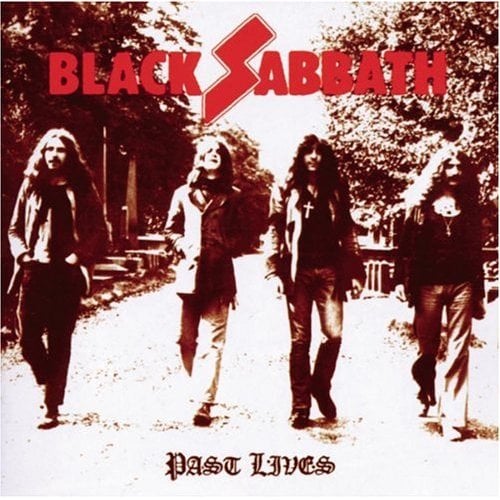
The colour schemes throughout the album covers are quite similar often including red and black within the design and also purple. There are other random covers but the majority come back to this dark death metal like colour scheme which keeps cropping up.


Once again the red and black colour scheme is present with quite dark satanic imagery.


Red again.

 
Initial Ideas


I started off coming up with a little mind map of the subject matter and what I wanted to try and include within the album cover. Drawing on what I know from the lyrics.

I decided to concentrate on the how i could portray the world to being doomed or shattered, with its dependency on money and politics. I came up with various visual metaphors to try and highlight aspects of the song. From imagery of the world in flames to signify how it is doomed, and also puppetery imagery to emphasize how the wolrd is controlled. I had a lot of different ideas and I wanted to try and include as many aspects as possible with out cluttering the design too much.


I wanted to show how the world was built on money and religeon etc. so came up with the idea that all the continents could be made up of relevant symbols to show the world is made up of those things. I also liked the idea of a television being the distraction from whats really happening to the world. I wanted to emphasize that the world is fucked at the moment and it stands for all the wrong things. The subject matter is pretty heavy and I wanted to convey the message in a dark and powerful way just like the song itself.


Digital Designs


 I started mocking up my design on illustrator but found that the globe I was trying to create actually looked nothing like what it was supposed to be. In order to make it look more like the earth i would have to try and make the icons have a similar shape to the worlds continents.


I ended up printing out a picture of the earth and then tracing over the image drawing the symbols over the tops of the continents and islands to produce something which looks a lot more globe like.

Once I had got the earth right I concentrated on the other elements of the design. I added a demon like puppet hand to emphasize how the world is controlled and manipulated. I also added in the TV displaying the lies on television. There was definitely something not quite right about the tv though that needed sorting out.


I addedin the flames onto the globe to show how the earth is burning away and being destroyed each day. I also reduced the size of the TV as it was taking away too much of the focus from the earth.


More experimentation


I had started to get close when I changed the TV to black, this created more of a silhouette of the TV leaving just the screen shining as if you were sat in the dark. The TV definitely still needed work and the type needed thickening as it was too scribbly.


I finally changed the size of the TV to size which complemented the composition. The typeface I have drawn is rough and looks a bit psychopathic, it is unstructured and looks kind of evil which goes with the theme of the song and also fits in with the bands image well. I have stuck to the red and black colour scheme which could be seen throughout Sabbaths album covers. The imagery is bold and eye catching and I believe is a good visual metaphor for the themes brought up in the song.


Final Mock Up

Monday, 17 February 2014

SECRET 7" - T-REX : Get it on

Brief


Secret 7" take 7 tracks from 7 of the best-known musicians around and press each one 100 times to 7" vinyl. The Brief entailed choosing a song to visually interpret in my own style, resulting in a one-of-a-kind sleeve for every 7”. The brief was pretty open and we were able to produce pretty much anything as long as it is within the size constraints and doesn't include the song name or artist on the design.

This was a good brief to get me back into the swing of things after my dissertation. I decided to first of all concentrate on T-Rex and the tune Get it On which happens to be a song I love and admire. Marc Bolan and T-Rex are brilliant and have created so many catchy riffs and rhythms. Because of my previous interest in the Band I decided that this would be the right tune to get me going.


Lyrics

"Get It On"

Well you're dirty and sweet
Clad in black
Don't look back
And I love you
You're dirty and sweet oh yea

Well you're slim and you're weak
You got the teeth
Of the Hydra upon you
You're dirty sweet
And you're my girl

Get It On
Bang a gong
Get It On

You're built like a car
You got a hubcap
Diamond star halo
You're built like a car
Oh yeah

You're an untamed youth
That's the truth
With your cloak full of eagles
You're dirty sweet
And you're my girl

Well you're windy and wild
You got the blues
I'm your shoes and your stockings
You're windy and wild
Oh yeah

You're built like a car
You got a hubcap
Diamond star halo
You're dirty sweet
And you're my girl 
From listening to the lyrics it is quite clear that the song is about sex, there is not much more too it really, he mainly sings about what his 'girl' is like. It is a simple tune with a catchy riff, the theme is simple and to the point which could result in some quite humorous sexual imagery.
Research


I decided to research into Marc Bolan and T-Rex to see if there was any visual references I could use on the album cover to show some kind of link between the band and the song and found that Marc Bolan generally played with 2 signature guitars. The Gibson Les Paul and also the Gibson Flying V. After looking at both of these guitars I found strong feminine and masculine references which I could play on. This was a huge coincidence but also really useful imagery to work with.

Marc Bolan's Signature Guitars
The Les Paul's silhouette is quite feminine, the body shape has the curves of a woman and also the channel changer looks just like a nipple. With a bit of experimenting with  the colour scheme I think it will be possible to emphasize these features to make it look more woman like.


Marc Bolan's Flying V also looks quite penis like which will also be a nice piece of imagery to play around with. I think there is potential for something quite interesting here and I will experiment further to try produce something which has strong sexual connotations. I think using Marc's guitars also help to build the link between the band and the song and strengthens the concept.

Initial Ideas / Design Boards


Because the deadline for this brief was fast approaching I set it as a fairly quick turn around project. I came up with the various Ideas for the cover over the course of a day. My initial idea's consisted of ways I could link music and sex thinking about the various components involved with music and sex. I wanted the imagery to be quite humorous and funny as there is no serious way of tackling the theme and the song is quite open as it is.


From playing guitar I realized there were some sexual references involved with the instruments and components, for instance the act of plugging in the AUX cable to the guitar can is quite sexual and this could be emphasized by the shapes of different guitar bodies. I wanted the design to be quite in your face and bold as the song doesn't really hold anything back. With this in mind I tried producing 'musical sexual imagery' which ties the 2 subjects together. I experimented with different instruments and musical equipment/components to draw references to the song, using phallic imagery and playing with the shapes of the instruments.


I also looked at using iconic aspects of Marc Bolan to reference T-Rex further and draw a link between the song and the artist. I looked at Marc's iconic hair and signature guitars and fond that there was definitely something valuable in the guitars. I thought this was a nice link to the band and also could use the shapes of the guitars to reference sex and highlight the theme of the tune.


I also looked at trying to incorporate the female and male icons to show the link between the sexes. I didn't think this was a strong enough link however so scrapped that idea on the head. I did like the 69 treble clef but I didn't think this concept was as relevant to T-Rex as some of the others and I wanted to try emphasize that aspect too.

Digital Mock Ups


After assessing my designs I decided to push the guitar concept further and work on how I can push the sexual references with Marc's signature guitars. I think this had the strongest concept and links the band and the song in a clever and interesting way. I think this idea is a lot less smutty than the other designs which is also a good thing as it is more subtle but still funny. I started by drawing up the guitars and experimenting with the colours to emphasize the human element of the design. The pink colour scheme helps to give the guitars that human element needed to make the instruments more sexual.

I experimented with how the guitar could be placed on the album cover in a position which will emphasize the references to the woman's body further. I found that the Les Paul was really curvy like woman and the channel changer looks just like a nipple which is perfect. By hiding more of the guitar and only showing a portion, it helps to make it look more human like, rather than being just a guitar.


I tried loads of different compositions until I found one that worked. I found they worked better on paper and when I was digitizing my designs they didn't quite have the same affect as I would of liked.


This design was a bit too smutty and I also don't like the composition, I don't think it works very well, there is definitely more room for improvement.


I started looking at the Flying V a bit more and decided hat the 2 guitars need to be in proportion as the design wasn't working like this. I don't think that the guitar looks that penis like either when it is all in view. The sexual emphasis is not there. I decided I needed to have a re-think.


After re accessing the flying V I figured I could experiment with the body more, I figured the body looked less like 'testicles' and more like open legs. I could still use the head of the flying v to reference the penis, so I decided to split the image up in an attempt to highlight the song theme.


To make the guitars look even more sexual I added underwear to the instruments in order to push the references further and make it clearer as I found some people still couldn't see the sexual connotations that the instruments display. I think this is a nice humour extra which improves the design and makes it clearer whilst still relating to T.REX and Marc Bolan.


It took a while to find an arrangement which worked best.


The exrtra knickers spoilt the composition so I decided to scrap that idea


After messing about for a while with the composition I decided on this design to work on, I found there was even a silhouette of a woman's figure in the negative space.

Final Design Colour Schemes


I decided to brighten up the colour scheme after printing it out as it wasn't as vibrant as I would of liked. I decided a much brighter colour was needed to emphasize the psychedelic era Bolan was from and also to give it a bit more sex appeal.


I wasnt happy with the knickers on the flying V so decided to add suspenders and fish net stockings instead, this adds a kinky element to the design and reinforces the subject matter.

I experimented with different colours but thought that the black and pink combo worked best and emphasized the theme more. Black and pink is very lingerie like.


Final Design


This was the final design I created for 'Get it On' I was really happy with the outcome in the end and have had some really good feedback, everybody could tell the theme of the song and hopefully the signature guitars relate back to Bolan well. The colour scheme is bold and reinforces the message, its almost very PVC like in some respects. I look forward to hearing back from secret 7".