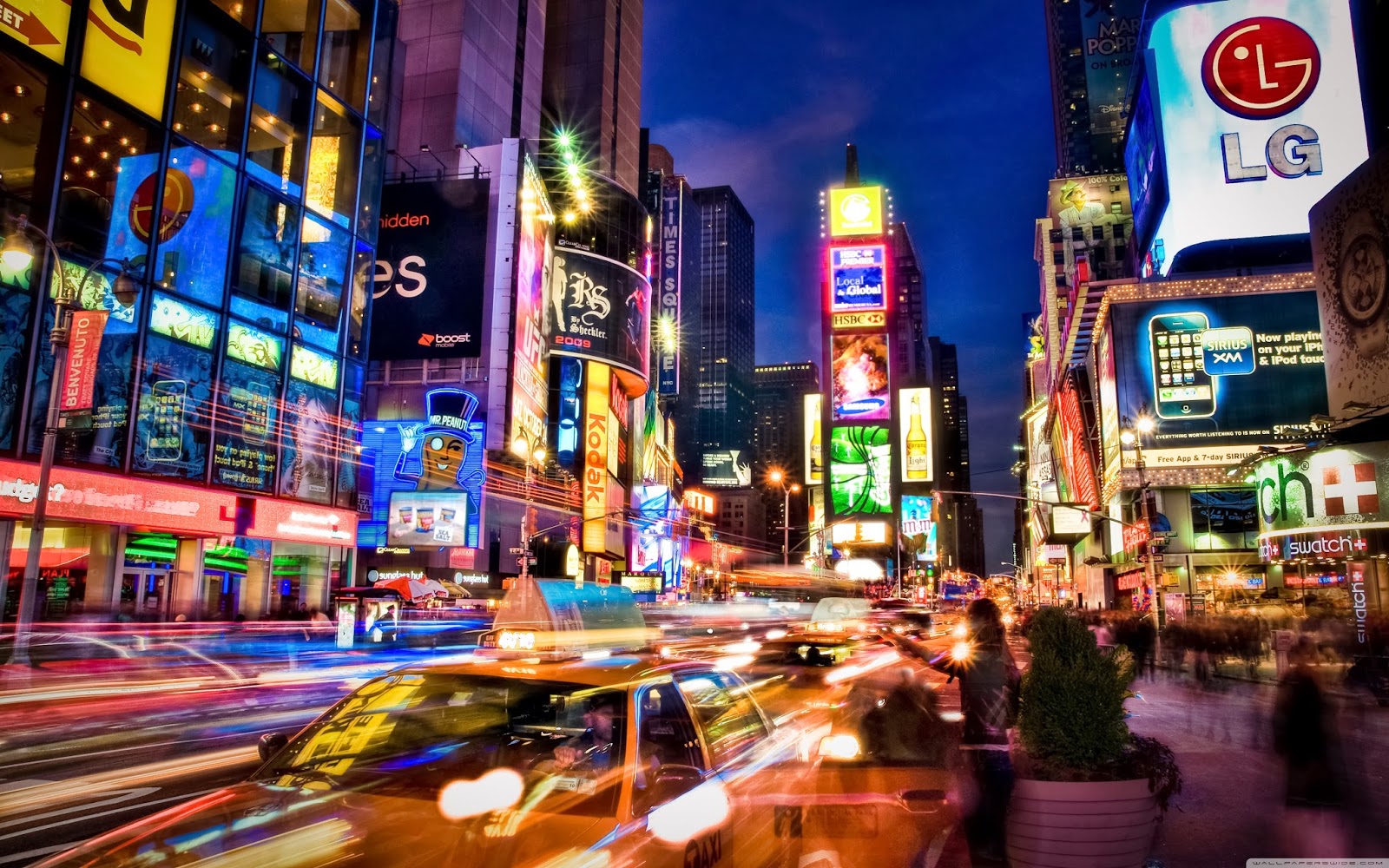
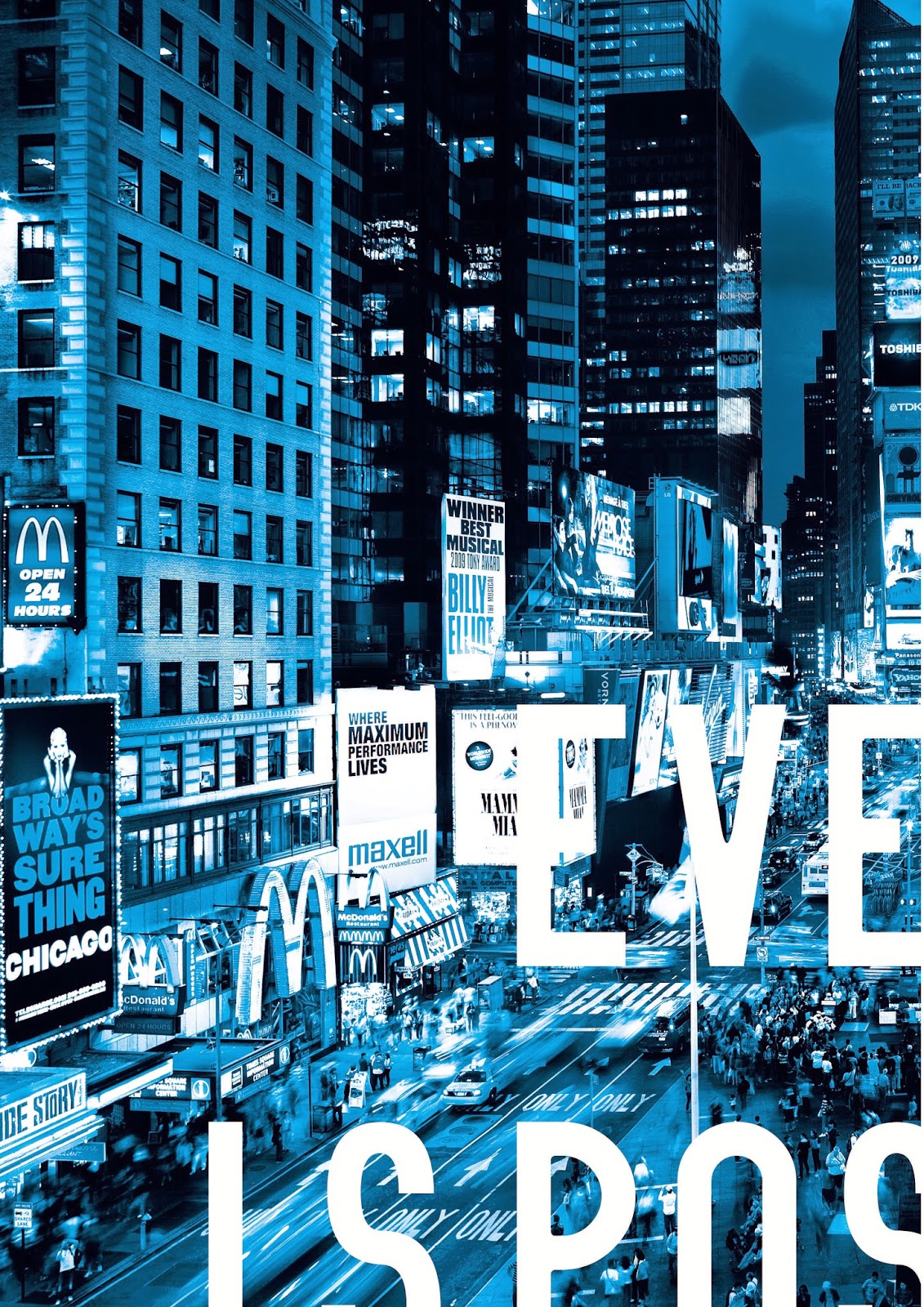
For the acetate window display we decided to use imagery of New York in order to relate to the films setting. We found images online and changed the colour scheme to suit that of the film. The colours blue and yellow were used a lot throughout and these seemed to be the colours which were enhanced the most.
Using Photoshop we edited the photos to suit, we used around 5 different images for the piece and cropped sections of each in order to overlay the panels to create a juxtaposed image of New York.
Once I had created the different panels I put the whole thing together and then overlaid the desired text on top so that the copy is readable n contrast to the juxtaposed image of New York to hint back at the contrast of clarity. I then split the image up into A4 sections ready for print. the idea will be to overlap the panels so that the light shines through creating different tones where the pieces cross.
Testing
In order to see if the panels fit together I printed them out and put them together on the light box.
Printing / Crafting
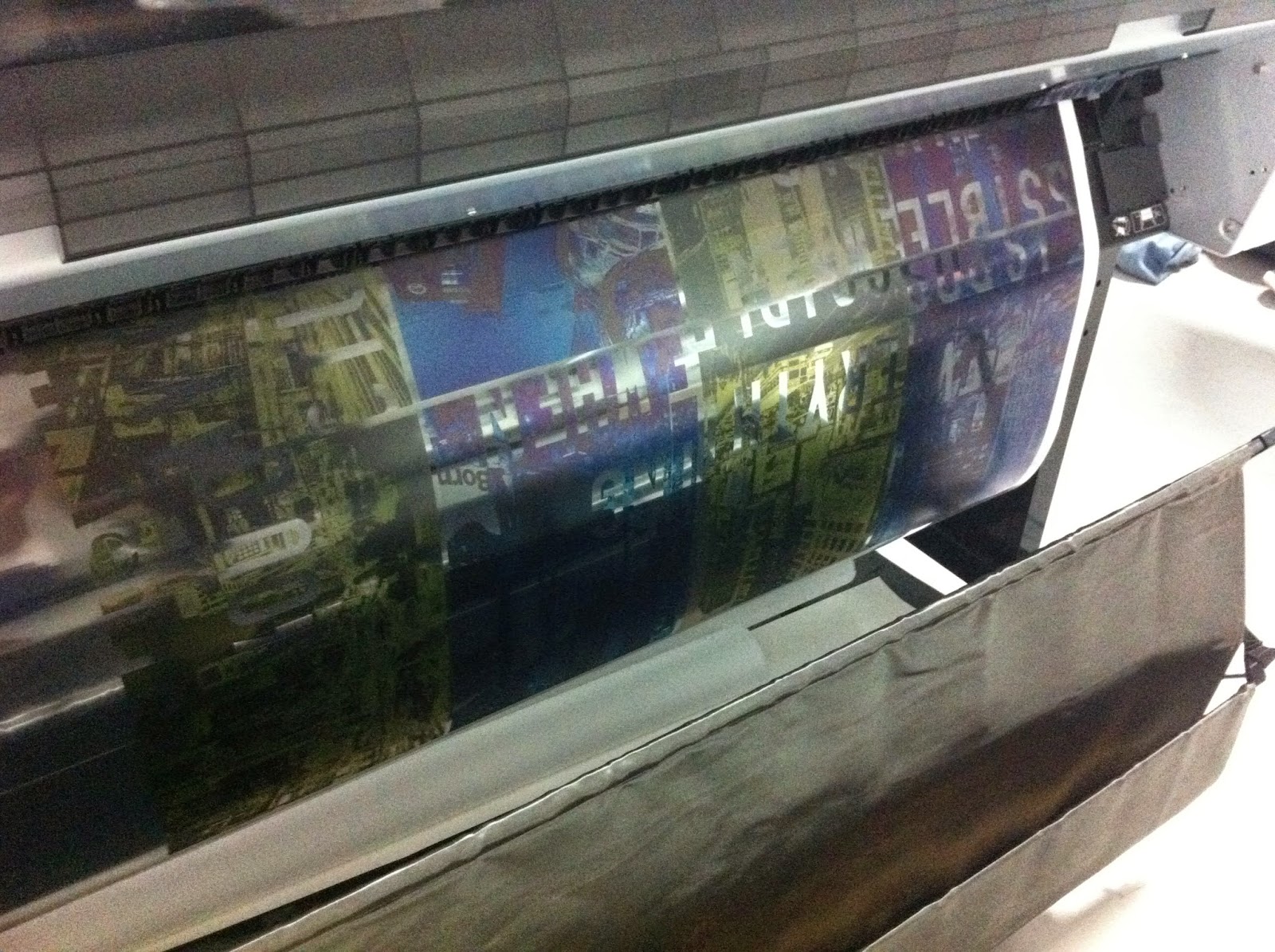
We bought 50 sheets of acetate online which turned out to be useless. Instead we had to get them printed on James's acetate which cost a small fortune but luckily the quality of the print was great so it wasn't a problem.
After printing out the panels we trimmed them down to size ready to put together and stick up on our chosen windows. We used double sided sticky tape to piece the bits together
Here is one of the finished acetate window displays shining the light through. This has worked really well the overlapping sections have created different tones which give it that pixelated panel aesthetic that we envisioned. The type reads well with the bright sky in the background.


No comments:
Post a Comment