Showing posts with label live. Show all posts

Saturday, 29 March 2014

Google Ident Shoot - Making of

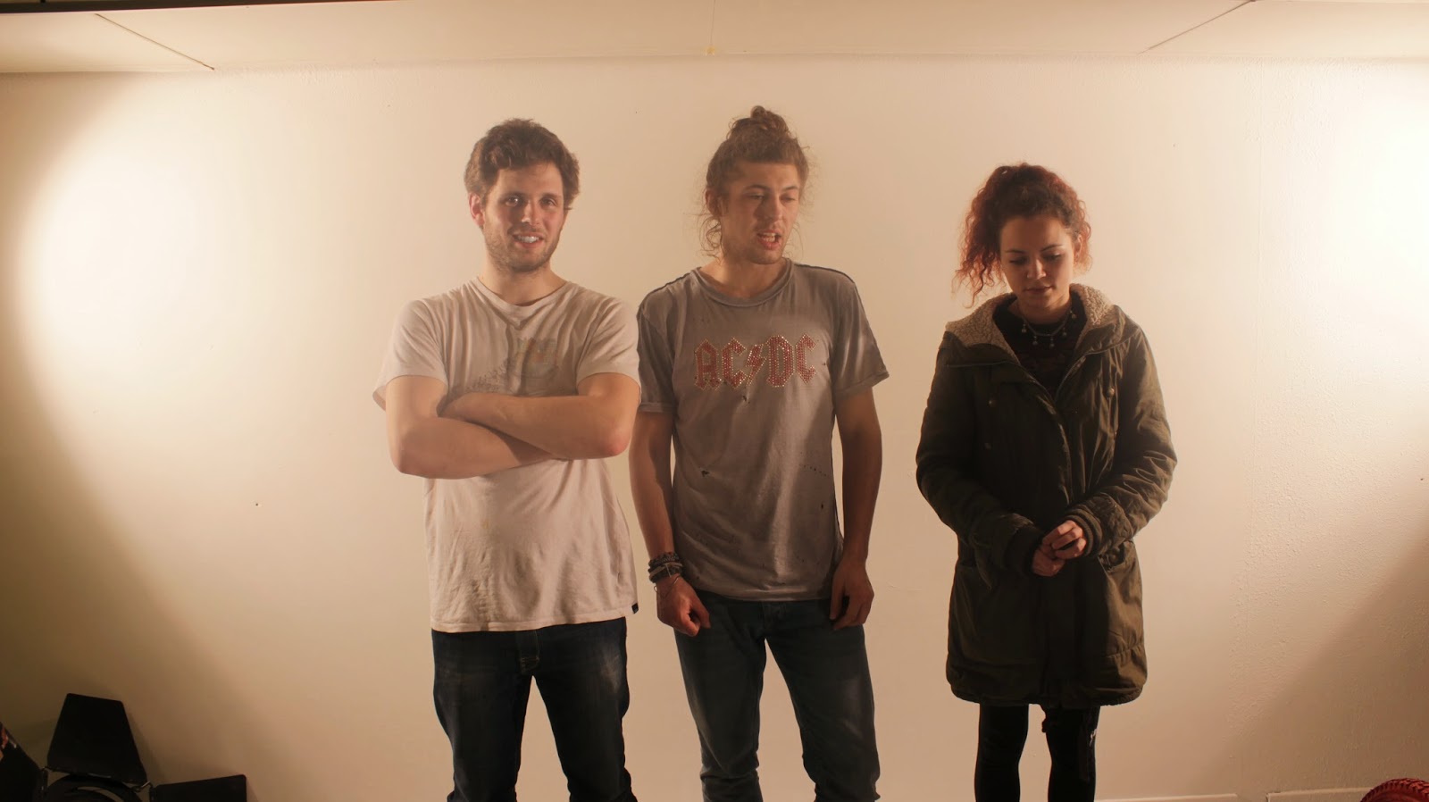
Over the course of the weekend we managed to get both videos shot. This took 2 15 hour days as loads of stuff kept going wrong. We had trouble overloading the power which kept short circuiting the whole building which was a major pain. When we arrived at the studio we had to completely paint it white to keep everything clean and clinical so that there is a nice contrast between the back ground and the objects. We shot the lanterns video on the first day. I acted in this video as the guine pig test subject pedaling the bike all day in front of boiling lighting.

The original edit of the lantern video had a lot of talking, we shot it like a science experiment using a professor and a subject i.e me. This turned out to be not what the client wanted so we had to re shoot parts of it afterwards as they didn't want an talking.

This was a really intense few days full of hard work, it was a really enjoyable experience and gave me an insight into what making a film is like in some respects, there is allot to consider, the lighting needed to be perfect, the positioning needed to be accurate, there were many factors to consider. We ran into many problems over the weekend but we managed to battle through. I also did a pretty good job at acting in the videos which was a bit odd at first as being in front of a camera doesn't really do it for me, but b the end of the weekend I found it pretty fun.


Making of Lanterns Video


Making of Powder Paint Video


Stills


Thursday, 27 March 2014

Google Ident Shoot Preperation

Once we had everything good to go we rented out a studio in Bradford and some lighting equipment for the weekend. We also rented out an amazing camera which could shoot in slow motion for the powder paint video. There was a lot of pressure on at this point as we had eaten away at the budget quite allot with all the equipment and supplies for the film, we only had this weekend to produce the videos as the deadline was creeping up,we needed to save time for the editing and had another meeting on Monday to show Google the progress.

Tuesday, 25 March 2014

Google Preperation - Testing

 Designing the Boxes for Lanterns


In order to display the logo we had to make boxes to slip over the top of the light bulbs, I created simple boxes on illustrator which would then be cut out on the laser cutter. We would then stick acetate over the gaps to make sure we can stick the letter forms counters back in the right place.

We also needed bases for the boxes so that the crocodile clips can sit nicely and also to make the whole set up look more professional and well thought out. I designed the structure and made sure it fit with theboxes and accommodated for the Jars.


We spent a few evenings staying up glueing everything together making sure to leave one of every object to film properly for the shoot. We had to test the electrics to make sure everything worked in advance so that nothing went wrong on the day of the shoot.
 Painting


In order to keep in tune with the Google brand me and Emily went into town to source spray paint which matched the colour scheme, we had to go to several shops until we had the right paint.

I then spent the afternoon painting all the boxes and the other bits and pieces for the shoot. Here are the black boxes to slip over the lanterns.


We decided to spray the bike the Google colours aswell to keep everything in tune with the brand.


Monday, 24 March 2014

Google Initial Video Script Ideas

Light Bulb Idea

1. first test homemade light bulb, going wrong, getting it right
close-up, hands making, practicing a stop motion set-up

2. stop motion of construction and development of the build of the light-bulb (no hands or human interaction involved) wire wrapping and winding its way around, components coming together in self-assembly…

3. assembling black boxes for the light bulb casing, laser-cutting, painting and putting together all pieces, close-ups, hands…

4. testing out light bulb inside a box, how bright is it, how much colour comes through in a black room

5. bike-generator development, testing out how much power is produced to power light bulbs etc. spray painting the bike into Google colours (time lapse?)

6. neat row of light bulbs, black boxes (pop, pop, pop….) appearing in sequence and then the lights turning off, everything in darkness

7. nothing to be seen, no music, just whirring bicycle sound starting up in the background

8. lights in box slowly turning on until at full glow/brightness

Powder Paint


1. set-up of studio space, the wall with Create logo on, positioning and prepping materials and spray mounting the surface - contrast camera shot of WHITE space against tubs of coloured powder (calm before the storm…)

2. making of slingshots, lots of people all assembling and preparing for battle, dipping finger in their colour paint and smearing across face for battle stripes, tension and build-up

3. close-up shots of facial expressions, calm before the storm, preparing to aim

4. CHAOS. slow-mo shots of colour paint clouds, floating, exploding, splattering against the wall etc. colour chaos people everywhere etc.

5. Colours, clouds and dust all settles to reveal the wall covered in paint (google colours) with the logo still in white gradually clearing up

Saturday, 22 March 2014

Google Idea Story Boards - Pitch

 Home Made Lanterns


Magnets & Iron Filings


Powder Paint


After sending off out story boards to Brandfuel we received the news that Google had decided to choose 2 of our ideas to put into practice. They picked the powder paint concept and also the home made lightbulbs, unfortunately the iron filings version was was too close to an idea Brandfuel had come up with and they preferred theirs. This was awesome and we were really excited to go ahead and get making.

Friday, 21 March 2014

Initial Ideas / Feedback

We brainstormed various ideas for the idents, and researched different creative ways to produce the logo using various different things, The idents needed to emphasize the message of think learn do, this entailed research into science experiments, crafting, art and other categories. The idents need to be quite ambiguous in the sense that the video should keep the viewer guessing whats going on right until the end, building up to the big reveal.

We wrote a massive list of our ideas and research and sent them over to Brandfuel to whittle out the weaker ones. From our list they chose the 3 best ones. From here we were instructed to test out the concepts and create story boards to be presented to google in a pitch the following Monday. This would be left up to me and Emily as we were in charge of all the designing & crafting.

Thursday, 20 March 2014

GOOGLE CREATE - BRIEF / ABOUT THE EVENT

The Event Overview - What is Google Create

Create is an event that takes the best of the events we know our target audience likes to attend ­ great speakers, great insights, and great interactions ­ and builds on that. And do this in an environment that feels like an exclusive retreat with peers. 
Create will be a 2 day event that feels like a festival of ideas. Inspiring content, a chance to learn from some of the top academics in the world, and partner with creative technologists and filmmakers to just get making.
zeitgeist CREATE 
 
a think, learn and do event.


The Thinking:
 
The event would kick off with Zeitgeist calibre speakers to get our guests thinking big. Sir Bob Geldof could open the event with an inspirational talk, concluding with a challenge for our audience (some of the best creative and marketing minds in the world) to address on Day 2.


The Learning:
 
The modern CMO needs to be a polymath. To help them along, we’ll bring some of the world’s leading thinkers in the fields they need to understand ­ Hal Varian on statistics and data, Alain de Botton on the human mind


The Doing:
 
The real difference in this event is the doing, and moving from thinking to doing quickly. Guests may leave Zeitgeist inspired, but this can easily be forgotten when returning to pressures of work. And at events like TED, rather than being empowered to do something themselves, guests are more likely to be pressured to support other projects.


Zeitgeist CREATE will get our guests doing things themselves, but we’ll give them the tools to get started. IDEO founder David Kelley will kick off our doing portion of the event with insights on how to think creatively, and will help to facilitate groups of CMOs, Creative Directors and other guests in addressing some of the challenges set by big thinkers such as Bob Geldof. 

The very nature of this event, with a focus on doing as much as listening, naturally allows for more bonding and relationship building.


BRIEF

This brief was under taken by a team of 4, Myself Emily Ball and 2 camera guys / editors Pieter Snyman and Jamie Merchant. They were looking for short idents which some up the concept of the event, think learn do!. They needed to be in tune with the brand and also innovative and original. These idents will be played on screens and projected around the event.

We managed to get to work on this brief because of Emilys Dad's business Brandfuel who are a top events organization company. They were basically putting on an event for Google, and one of the aspects they had pitched to them was to create idents for the event. We were fortunate enough to get involved on the project. They wanted us to come up with ideas for the idents. Once we had come up with different ideas we had to send them to Brand Fuel, who then picked the ones they liked to push further.


We wish to create some video “Idents” about 30 seconds to one minute long.  Ideally they could be “loopable”. The idea is to provide a taster – a flavour of whats to come in the event.  The identity of the event has a subtext – “Think, Learn and Do”.  This is important because for example a CGI ident is not in keeping because it “doesn’t get its hands dirty” i.e. Do!

The test I sent you shows some of the planning, some of thinking and tests, some of the heavy lifting off the work such as dyeing the string etc and then the final creation of the ident itself which is the easy bit!

So, we would like to create a ‘suite’ of “Create” idents – they should always be around creating the logo itself and preferably as close as possible to the type-style of the logo. They should be relevant – to a certain extent – Art, technology, food, foraging are all examples of what the delegates will be experiencing.  We are working with good chefs, we have speakers on “Mindfulness like Dan Ariely”, we have a partnership with “Technology will save us” where delegates will make small electronic kits.

Our ident ideas so far:-
The String Art
Making Jelly letters (from your idea!) the process, the cutting and shaping, and then melting them back to liquid)
Growing cress in the shape of the logo (macro close ups of growth, white washing the finished cress, colouring the letters and then washing them back to green)
Making the logo out of dough (watching it rise, slicing it in half and spreading different coloured stuff on top!)
A mash-up of different mini electronics kits, soldered together and finishing with a switch turning on the logo in LEDs
The planning and execution of filming the logo made with coloured screens of Nexus 10 devices at night.

Music is the other thing to keep in mind, ideally we would like to have license free music – could even be classical but wouldn’t rule out a good track that fits the film.

(BrandFuel)

Tuesday, 18 March 2014

Google Ident - Primary Research

UKTV Watch


Ambiguous, and interesting idents exploring CGI. Really nice idents.

4seven Idents


Channel 4 have the idents down to a T here are some beautiful examples of using perspective to create the logo

Syfy Europe


Here is another great  use of CGI, its clever and interesting whilst also ambiguous.

Fashion TV Espana


Here is a lovely example of a mixed media ident combining both hand drawn elements and digital artwork and photography.
 
We are looking to create idents which have a similar wow factor however they will all be done by hand using hands on crafted methods as apposed to CGI. The event is about thinking, learning and doing and we intend to convey this message in our videos displaying human tactile idents which are in tune with Google's clean cut creative brand.

Friday, 10 January 2014

Datashed - Work Online / Evaluation of Experience


After a month or so, Ed got in touch with me to let me know my work had been uploaded to their website. It was great to know that my work was out on the web for all to see. This experience has spurred me on to seak more client work. I find the that producing work is much more worth while when there is the prospect of exposure. It has been a great learning curve working on a professional basis. It has taught me to how to speak with clients and the type of communication I will be dealing with. I got lucky with the Datashed as my previous experience with clients has been very different and much more awkward. Both Ed and Anna were extremely helpful and we worked well with each to get the finished results. There were a few alterations along the way but all in all the project went relatively smoothly. I was able to meet target deadlines which is always good in the real world.


One thing I would probably do better next time is my board for initial Ideas. I just had pages of sketches which the client didn't mind however I think they could of been a bit more spread out and organized as I had loads of ideas crammed into several sheets. The drawings were good however it was slightly over crowded. Another thing this brief has taught me is how to fill out an invoice as I actually got paid for this which is awesome. This project has been an eye opener into how I could carry on with freelance work after I finish Uni if I need to. Hopefully I will start to gain more free lance work over the course of the year. I was really lucky that this brief gave me the chance to do some digital illustrations which I am starting to enjoy more and more as time goes on. I am really happy with the final outcome and hope just hope that more work comes along like this.

Wednesday, 11 December 2013

ELMWOOD BRAND THE BORING - Concept Boards


After taking board feedback from the crits we had with Steph I made some changes. Instead of sticking with the black and white colour scheme I decided to incorporate gold leaf into the products. This way it relates more so to traditional bibles, and also gives the brand a sense of luxury. I have also added some extra products and considered the placement of the shop in an attempt to push the concept to its limits.

Tuesday, 10 December 2013

THE DATA SHED - Concept Boards

EDIBLE TYPE - Concept Boards


Evaluation

I found this brief was really fun. It was only a quick brief but It I think the finished product was well thought of and produced well. It was nice to get away from the computer and work in a different way for a change. I find that working on the computer for an extended period of time becomes really taxing on the mind and body. This brief gave me the chance to work with sweets which is always a good. It all went relatively smoothly until I came across a missing letter. I had done well getting enough letters to produce the word search but it was a missing T that forced me back into town to get re-stocked in time to get the poster glued together. Surprisingly the sweets bonded with the super glue without damaging the sweets. This makes me wonder what actually goes into the sweets. It was nice to produce a poster which hasn't been printed. I really liked working with this media and there is definitely room to push this concept further. You could make many word game style posters using hard ABC candy and this is something to consider in the future.

Monday, 9 December 2013

EDIBLE TYPE - FInal Poster

Edible Word Search


After finding out I was getting to use my design for the edible type branding I decided to re do my poster. In order to do so I had to go back to the market to get hold of some more T's as I was short in the previous poster. I drew out a grid and used the light box to project the grid through so I could make sure my type was set up neat and straight. Once I had done this I glued each of the candy letters down finishing it off with my initials in the bottom right. I used strawberry boot laces to ring the words in the word search.


In order to get a good photo of the poster I took it down to the photography studio, where Gretta helped me to get some nice shots of the poster. We experimented with the lighting in order to get a clear image with some nice shadows. The poster photographed great and I am really happy with the outcome.

Final Photo


I changed the vibrancy of the image in order to make the letters pop more giving it that rich sweet glow emphasizing the candy. The square composition works well and the information reads clearly. I am happy with the concept and the way it has turned out, the fact the type is 3D and edible adds to the spirit of the competition. The 3d element helps to catch the viewers attention and hopefully the fact it is different from your average poster will help as well. This was a fun brief to do and I am thoroughly happy with how it has turned out.

THE BEAUTIFUL MEME - Concept Boards

DR.ME COLLABORATIVE FLAG - Concept Boards

Saturday, 7 December 2013

Edible Type Poster

I went to the market and got 300grams of ABC candy in order to produce the poster, after returning I realized out of the huge bag I only had one 'T' which was a bit of a problem so I have had to Photoshop the T in the for the time being. 

Candy Alphabet
 

I laid out the alphabet at 1st to check I had everything

Word search layout


 After mocking up the 1st poster I realised i had spelt thirteenth wrong and decided the best option would be to stick to photography as adding digital 'ring' elements around the words spoilt the composition and made it look a bit rubbish, the mix of 2 media doesn't work here.

Final Idea

In order to stick with the edible theme i decided to use strawberry boot laces to ring the words highlighting the desired type within the poster. I think the poster works well and represents the competition and theme well. Unfortunately I was late for the pitch so I am hoping I will still be considered for the entry.

Edible Type Poster Research

Biscuit Poster

Rice Paper and Edible Inks

There have not been that many edible posters made so this is something which is quite unique and special. I look forward to making my own version

Possible Sweets to work with

ABC candyland

Barrats Alphabet Letters

ABC Candy Letters
I have seen these in the market, these are probably the best bet.

Friday, 6 December 2013

Elmwood Brand the Boring- Initial Ideas


One of the first things I started doing was trying to see if there was any word play I could work with using cobbler terminology and found there was quite a few religious references. This ended up being the basis for my branding. I listed words and phrases and whittled down the ones I could work with. 


Once I had decided on my concept I began to come up with various names, I researched into cobbling and also religion to see if there was any references. I found a patron saint of cobblers called st Crispin but decided I was probably taking it too far and also people might not get the reference. Instead I came up with more obvious names linking the 2 themes together.


The next stage was coming up with the logo, I researched into various cobbling tools and items linked with the profession and experimented with different elements to try and produce a logo which links the 2 themes together. I decided I would have to go with the cross but it was linking it to cobbling which was the problem.


I came up with a couple of ideas for how I could push the brand and apply it to various products. I wanted to try and exceed the standard branding application and try and push it too its limits I came up with indents of the logo on the bottom of the soles, like christening them and also a branded shoe horn. these were just the initial stages of the design process.