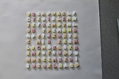
I
went to the market and got 300grams of ABC candy in order to produce
the poster, after returning I realized out of the huge bag I only had
one 'T' which was a bit of a problem so I have had to Photoshop the T in the for the time being.
Candy Alphabet
I laid out the alphabet at 1st to check I had everything
Word search layout
After
mocking up the 1st poster I realised i had spelt thirteenth wrong and
decided the best option would be to stick to photography as adding
digital 'ring' elements around the words spoilt the composition and made
it look a bit rubbish, the mix of 2 media doesn't work here.
Final Idea
In
order to stick with the edible theme i decided to use strawberry boot
laces to ring the words highlighting the desired type within the poster.
I think the poster works well and represents the competition and theme
well. Unfortunately I was late for the pitch so I am hoping I will still
be considered for the entry.


No comments:
Post a Comment