After creating the secret monitor we needed a video to play on loop for our audience to see. The original plan was to create our own fractal zoom but this proved allot tougher than we thought. I got my friend Piet to help me create a video to advertise the movie as his editing skills were much better than mine. We came up with this simple clip by overlaying text I created in illustrator over footage taken from the film, we used premier pro and after effects to edit the video. The typeface used is the closest one to the actual one used in the current advertising in order to give it that Limitless aesthetic for those who already know the film. The clip needed to be short enough that people can view it all quite quickly so it makes sense if you put the glasses on half way through, this way it will restart quickly.
Saturday, 26 April 2014
Fractal Zoom Video Advertisement
After creating the secret monitor we needed a video to play on loop for our audience to see. The original plan was to create our own fractal zoom but this proved allot tougher than we thought. I got my friend Piet to help me create a video to advertise the movie as his editing skills were much better than mine. We came up with this simple clip by overlaying text I created in illustrator over footage taken from the film, we used premier pro and after effects to edit the video. The typeface used is the closest one to the actual one used in the current advertising in order to give it that Limitless aesthetic for those who already know the film. The clip needed to be short enough that people can view it all quite quickly so it makes sense if you put the glasses on half way through, this way it will restart quickly.

Friday, 25 April 2014
Creative Advertising - Acetate Window Display
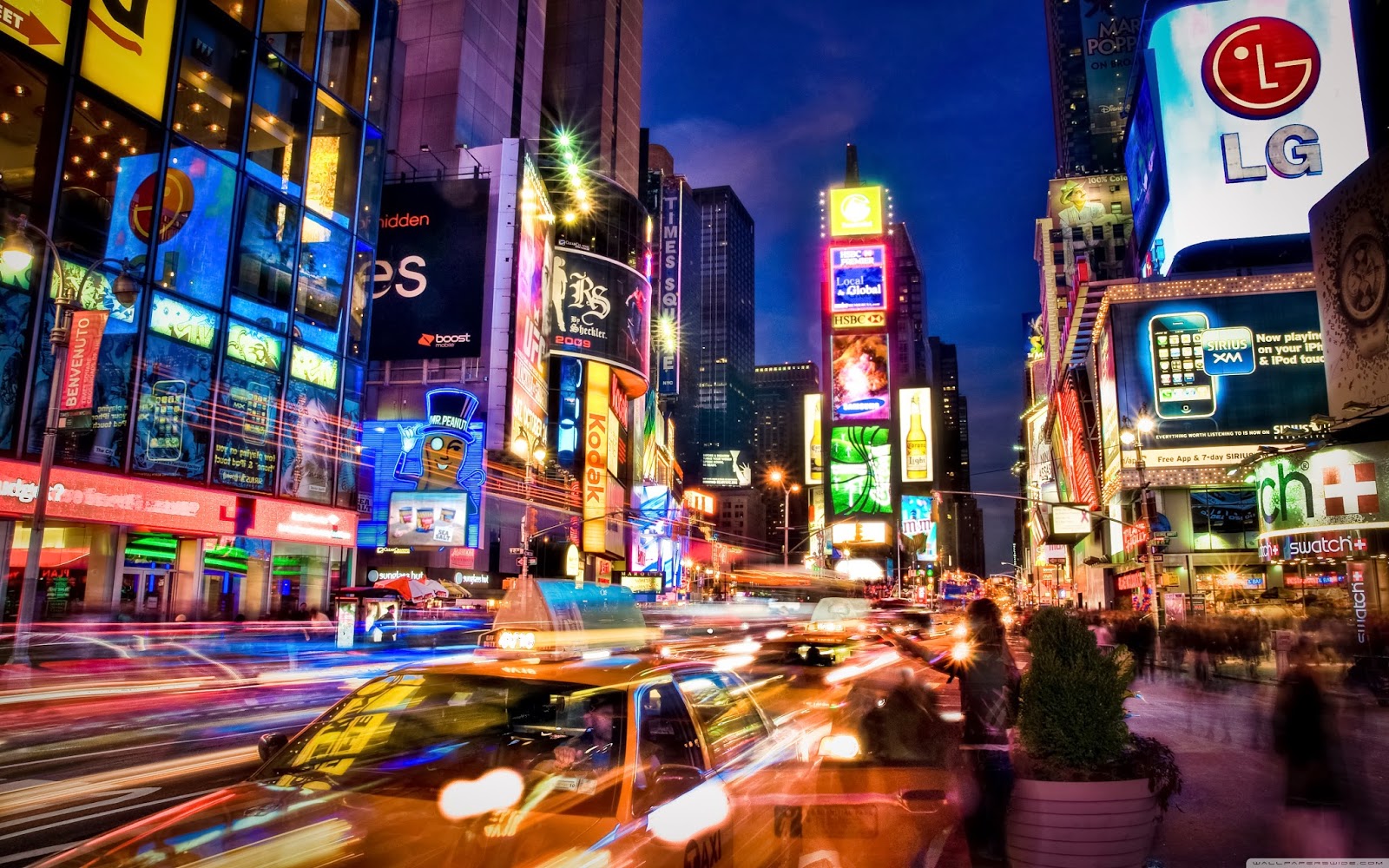
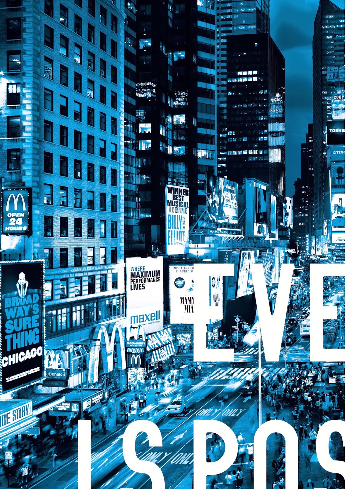
For the acetate window display we decided to use imagery of New York in order to relate to the films setting. We found images online and changed the colour scheme to suit that of the film. The colours blue and yellow were used a lot throughout and these seemed to be the colours which were enhanced the most.



Using Photoshop we edited the photos to suit, we used around 5 different images for the piece and cropped sections of each in order to overlay the panels to create a juxtaposed image of New York.



Testing

In order to see if the panels fit together I printed them out and put them together on the light box.
Printing / Crafting
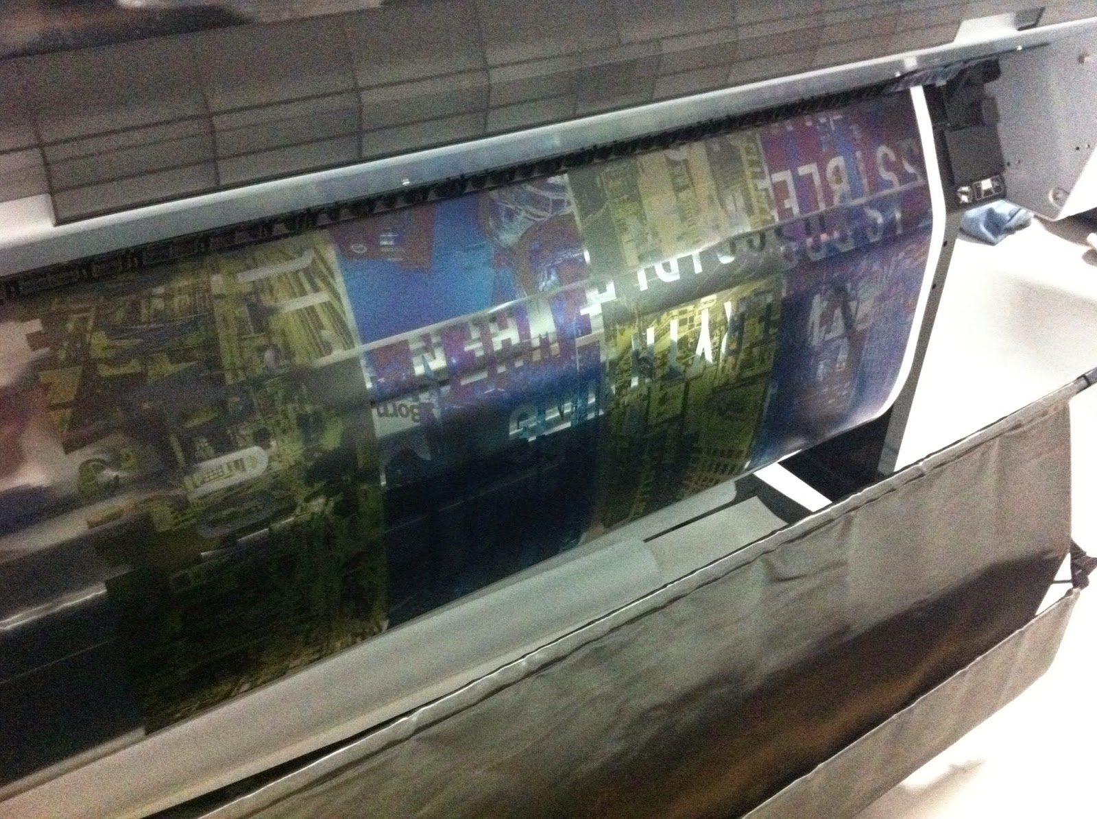
We bought 50 sheets of acetate online which turned out to be useless. Instead we had to get them printed on James's acetate which cost a small fortune but luckily the quality of the print was great so it wasn't a problem.

After printing out the panels we trimmed them down to size ready to put together and stick up on our chosen windows. We used double sided sticky tape to piece the bits together

Here is one of the finished acetate window displays shining the light through. This has worked really well the overlapping sections have created different tones which give it that pixelated panel aesthetic that we envisioned. The type reads well with the bright sky in the background.
Secret Monitor

After a trip into Headingly me and Mikey came across an old monitor in Oxfam for sale so decided to buy it and give the secret monitor ago. After an hour or so we managed to peel the polarizing layer from the screen. This was a pain to do and left glue marks all over the monitor. Mikey then spent a total of 4 hours cleaning off the glue residue to make the screen look more presentable.
Our original plan was to replace the lenses of 3d glasses with the layer we had removed however the film was too blurry to be used for a pair of glasses. We found that 3D glasses from the cinema worked but the lenses were the wrong way round to see the image clearly.
Here you can see the screen in action after removing the polarizing layer. This film controls how light travels through it creating the image when the 2 are combined. The film essentially controls the flow of light waves to produce a clear picture.
Sourcing the Polarizing Sheets
After playing around with some 3D glasses it became apparent that they were built in a way that we couldn't replace the lenses. This was a bit of a problem as we needed a pair to add new lenses to. I spent a few days researching where we could get polarizing film. I found out that we needed circular polarizing film which mainly comes from America. it is also very expensive and there were few British companies which stocked it. The majority of places I cam across charged £20 for a 10cmx10cm sheet. After ringing several companies explaining the project I came across one British company called instrument plastics who agreed to send some samples for free. Originally they were going to send 1 credit card sized piece, but luckily I managed to charm the lady on the phone into sending 2 10cmx10cm pieces which should have been sold for £44 so I was extremely greatful!
If you don't ask you don't get is the moral from today!
Creating the Glasses

After having no luck modifying glasses we resorted to an alternative, I searched the web to find a template for some children's glasses. I took the template and modified it to make it fit for adults also adding a front panel to trap the lenses in. This was really handy as It is assembled using just wooden parts with no need for any other pieces like metal hinges.

Here you can see the glasses after being put together and the net which was cut out, the glasses are made up of several parts which slot together to create the hinges. the pieces have small teeth which are used to hold the bits together. The glasses work really well and the mechanism is relatively strong.

This is Mikey modeling the glasses and looking pretty swarve. All that is left to do now is wait for the film to arrive and cut it to size and glue the front on to trap the lenses in between.
Thursday, 24 April 2014
Creative Advertising Shopping List / Designating Tasks
After deciding on the products we wanted to produce we had to source the materials needed for each of the jobs:
- Monitor
- 3D Glasses
- Polarizing Film (for glasses)
- Old Phone with Answer phone
- Empty Book
- Acetate
- Small Button Bags
We also decided to split the products up so that we could both get on with something different and maximise our use of time. We constantly conferred and made final design decision together in order to keep the products consistent and to help give some guidance.

Product Jobs
Me
- Book Sleeve
- Flyer Tabbed Version
- Brain Signage
- Acetate Sign 1
Mikey
- Business Card
- Flyer Blurred
- Acetate 2
Joint
- Laser cut pills
- Set up adverts
- Letterpress book content
What we need to find out / do
- Rules on advertising around college
- How to work the projector in the Lecture Theature
- Book the lecture Theature
- Decide a date and time
- Ask about renting a computer
- Mass email
- Monitor
- 3D Glasses
- Polarizing Film (for glasses)
- Old Phone with Answer phone
- Empty Book
- Acetate
- Small Button Bags
We also decided to split the products up so that we could both get on with something different and maximise our use of time. We constantly conferred and made final design decision together in order to keep the products consistent and to help give some guidance.
Monitor & phone from Oxfam
Product Jobs
Me
- Book Sleeve
- Flyer Tabbed Version
- Brain Signage
- Acetate Sign 1
Mikey
- Business Card
- Flyer Blurred
- Acetate 2
Joint
- Laser cut pills
- Set up adverts
- Letterpress book content
What we need to find out / do
- Rules on advertising around college
- How to work the projector in the Lecture Theature
- Book the lecture Theature
- Decide a date and time
- Ask about renting a computer
- Mass email
Wednesday, 23 April 2014
Creative Film Advertising - Perspective Typography Day 3
We came across some problems when hanging the sheets as we were securing them to string which sagged and threw off the measurements. We decided to use dowel rods to place across the beans in order to make sure we could be as precise as possible. We set up the sheets a meter apart in depth and worked out exactly where all the sheets would hang in relation to each other.

After taking measurements and plotting on the type I spent the afternoon recreating the panels on the computer. From here we planned to print them out and create the set up on a smaller scale.


After taking measurements and plotting on the type I spent the afternoon recreating the panels on the computer. From here we planned to print them out and create the set up on a smaller scale.
Digital Panels
After printing out the pannels we set up a similar set up to the 1st day but found that our measurements didn't add up. This was really disheartening and after 3 days of experimenting we decided to knock it on the head and get on with the other products as we were at risk of not having enough adverts if we carried on with this. This was a huge learning curve and taught us the importance of planning ahead.
Tuesday, 22 April 2014
Creative Film Advertising - Perspective Typography Day 2
On the second day we set up in Studio 3 to try and work out how we could make our idea reality. We got some large sheets of true grain from the print room and hung the pieces from the ceiling at different depths and positions in order to create the panel like effect seen in the movie. We used bull dog clips to keep the sheets as steady as possible.

We projected the type onto the sheets to find that it fit nicely across the 4 panels. Once we had set this up we used pens to mark on where the letters sat so we could create digital replicas to print

Here you can see the panels from a different view where they don't make any sense. This ambiguity will hopefully create interest and entice students into coming to the film. This is a much more interesting way to grab peoples attention rather than the standard poster.

After drawing this up all day we realised it wasn't actually as easy as we thought, the maths would have to be exact in order to recreate this effect and would be really hard to set up again in a different position especially when we need to find somewhere to hang it from. We decided that the space over the balcony of the graphic corridor would be ideal as it wouldn't get in anyone's way and would also work perfectly as you walk around the corner to be greeted by these huge sheets. We decided we would try again the following day but use precise measurements to work out the perfect placement of the sheets.
Monday, 21 April 2014
Creative Film Advertising - Perspective Typography Day 1
We came up with another idea to link the contrast of clarity which is seen throughout the film and also to relate to a pixelated panel scene which has previously been shown in the research. We realized this concept would work using perspective typography. As this can be seen from only one position and from any other spot looks unclear and unreadable. As we couldn't project and paint onto the walls we came up with another alternative which would involve having type displayed across several panels. We would plan to hang these somewhere in college so that they could only be read from a specific angle.

To start with we tried creating a mini mock up of how it could look. We planned on creating a small scale version and then increasing the distance and the size of the panels when it came to producing the actual versions. We spent pretty much half a day trying to do this with no look.

The panels kept blowing around and there was no real way of drawing on the paper without it moving. We decided to give up on the small version and planned to try it full scale by setting up the sheets in the right place taking meausrements and projecting the type onto the panels in order to mark on key spots.
To start with we tried creating a mini mock up of how it could look. We planned on creating a small scale version and then increasing the distance and the size of the panels when it came to producing the actual versions. We spent pretty much half a day trying to do this with no look.
The panels kept blowing around and there was no real way of drawing on the paper without it moving. We decided to give up on the small version and planned to try it full scale by setting up the sheets in the right place taking meausrements and projecting the type onto the panels in order to mark on key spots.
Subscribe to:
Posts (Atom)