I decided to tackle the brief that Lizzi Set. I thought this would be a good opportunity to get my creative juices flowing. The majority of the work I have been getting on with at the moment is for my dissertation. I have been trying to read as much as I can on my topic at the moment. But as a treat I thought I would give this brief ago.
I decided to do this pretty last minute so I only had a choice of 1 song and 2 films.
Films:
Scrooged
The Santa Claus
Song:
Merry Xmas (War is Over) John Lennon
I decided to go with Lennon's masterpiece, Merry Xmas. The song has a really strong message behind it which is basically to stop the wars. Its promoting world peace whilst also celebrating Christmas. The song is a bit of a mockery of the world and how wrong and awful it has become, full of terror, war and famine. The songs message is clear and powerful and I wanted to try and capture this within my design.
Colour:
Green - R=5 G=149 B=71
Consideration:
Use of type is essential
Initial Ideas:
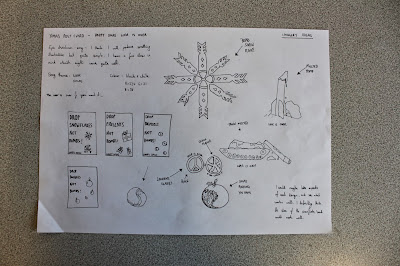
After listening to the song I wanted incorporate aspects of the message of peace and also Xmas. I started sketching Ideas of how I could link aspects of war and xmas together in subtle ways. The first thing I came up with was a take on the drop beats not bombs campaign. I thought this would be a good route to go down as it is already a part of contemporary culture which means it will recognizable and people can already relate to it. I came up with a few different Ideas but felt only a couple worked well in terms of alliteration.
Slogans:

Drop Brussels Not Bombs
Drop Snowflakes Not Bombs
Drop Baubles Not Bombs
Drop Presents Not Bombs
I thought this was a pretty humorous route to go down however I am worried that it strays away from the song. There is no direct relation only relevance to the peace aspect which the song is getting across. I like the concept and the idea but I am worried others may not find the link between the post card and the song.
I started to think about what happens when Xmas is over to see how I could relate it to the (war is over) message of the song. Then I realized when the snow goes Xmas is usually over so I thought I could maybe use imagery of melted snow sculptures such as a tank etc. This is quite interesting ad conceptual Imagery which I feel gets the message across well.
I also thought I could combine snow flakes and weapons of warfare like bombs, missiles etc. I thought I could end up with some nice imagery to work with from this idea. It works visually and also highlights the concept of the song which I think works well. This could work in a pattern format also.
Here is a melted missile which I thought I could work with. Its quite a powerful image with a strong message behind it. This could struggle to look like snow in green unless I use inverse colours.
I thought of ways I could link Xmas elements with aspects of peace and war in an attempt to merge the 2 subjects. I found this allot easier than expected to be honest and there were a few symbols I could work with. I decided the yin yang would be awesome to work with. Its circular like a lot of Xmas objects which was a good start and the fact it represents peace and balance.
I thought Lennons glasses would also be a good image to work with. Its iconic and recognisable. I thought I could incorporate aspects of peace and Xmas within the lens's of his glasses. I think the combination of the 3 symbols represent the song well.
Glasses + Peace + Xmas = Merry Xmas War is Over
Lyrics
After speaking to Lizzi again she informed me that my postcard had to be type based which was a bit of a shock as everything I had been coming up with was fairly image concept heavy. With this in mind I decided to change my approach slightly and start looking at the lyrics of the song. I wrote down a few verses which I thought summed the song up best and had the most powerful message behind. After deciding on the lyrics to work with I started digitizing my designs to see how they looked on screen.
TYPE CHOICE
In order to make further reference to the song and the message behind the music I researched into the song and came across the branding and signage for this record. Here you can see John and Yoko with the War is Over iconic sign which was a really key aspect of the campaign. The typeface used was Franklin Gothic Extra Condensed. I thought it would be good to create my own Christmas take on their poster using the same typeface but using my own concept.
DROP.......NOT BOMBS
I played about with the yin yang to find it could double up as many Xmas
objects which worked really well with my design.
The composition of the piece doesn't work here. The type is strong and bold though
which I think works well and kind of mimics Lennon's poster. Drop snow doesn't
have the best ring to it though so I don't think I could use this.
Again the message is funny but it doesn't have a ring to it.
I like drop baubles as a phrase but I still think it takes away
reference to the song too much
Theres too much going on with this. The yin yang Brussel is too big
Too boring
I really like having a full colour background, it makes the post card
look allot more christmas like. But there is still too much going on.
Inverse version
I got rid of some of the brussels in order to create this xmas tree like
structure which I think is a nice concept. The yin yang brussels also
look like they have snow on one side which is a nice touch.
Experimenting with Layout
Strong Visually but too green
Trunk type version.
Lyrical Version

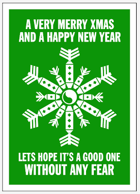
Snowflake Inspiration : I decided I liked the imagery of the bomb snow flake so began to
play about with different shapes until I came up with something I was happy with.
I started using the same bomb shape I created for each
section of the snowflake but found this was too uniform.
I started altering the tips of the bombs in order to create some variety.
After having another look at my sample snowflake I realized it didn't
quite have the structure that I wanted so I began to re-size and rotate various
bombs in order to create an flake which looked more realistic.
I altered the tips again in order to correct the composition.
I needed a central piece for the flake
So I ended up using the yin yang in the center to symbolize peace
Pattern
Lyrics
Here is the lyrics I decided to go with. I think they are christmassy enough but also incoprotae the aspect of war within the lyrics which I think is important. Here is a rough starter.
I think the postcard works well in both colour versions. However
I don't think the white stands out as well. The type isn;t perfect on this version
I corrected the type and made it all aline. I think it works much better here. The type has a strong impact and I think the design works well as a whole. I have included aspects of both Xmas and peace and war, whilst also keeping it in the style of Xmas. Using Franklin Gothic Extra Condensed also gives reference to Lennon and Yokos sign which I think is a nice link and some fans may find the link here. I had to consider the size of the design a few times as I realized some elements would be too small when printed but since then I have corrected the mistakes. The green works well and the white space references snowy times. Overall I am really happy with the outcome. I explored a range of ideas and feel I could probably push some ideas further but for now I have fulfilled the brief.


No comments:
Post a Comment